Warm congratulations on signing a development contract with Jiangsu Tianrui Instrument Co., Ltd
2020-11-09 02:34:26 Source: Unknown Author: admin
Bomin technicians collaborated with Jiangsu Tianrui Instrument Co., Ltd. on the construction of a high-end responsive website project in Suzhou. After multiple discussions and demonstrations, the cooperation was finally successful and the contract was officially signed on February 17, 2016!
Customer Profile: Jiangsu Tianrui Instrument Co., Ltd. is a high-tech enterprise with independent intellectual property rights, with a registered capital of 230.88 million yuan. It has two wholly-owned subsidiaries, Beijing Bangxin Weiye Technology Development Co., Ltd. and Shenzhen Tianrui Instrument Co., Ltd. Headquartered by the beautiful Yangcheng Lake in Kunshan City, Jiangsu Province. The company specializes in the research, development, production, and sales of analytical testing instruments and software for spectroscopy, chromatography, mass spectrometry, and other related fields. The company has been awarded honorary titles such as "National Torch Plan Key High tech Enterprise", "Jiangsu Province High tech Enterprise", "Jiangsu Province Software Enterprise", "Jiangsu Province Science and Technology Innovation Demonstration Enterprise", "Jiangsu Province Planning and Layout Key Software Enterprise", "Jiangsu Province Spectral Analysis Instrument Engineering Technology Research Center", etc. The product has internationally leading technological level, and the X-ray fluorescence spectrometer series products have been recognized as "National Key New Products" and "Jiangsu Province High tech Products". The product range is complete, providing professional solutions for environmental protection and safety, industrial testing and analysis, and other fields.
Responsive websites are deeply loved by customers. Below, Bomin editor will summarize them for everyoneSuzhou website constructionThe meaning of responsiveness:
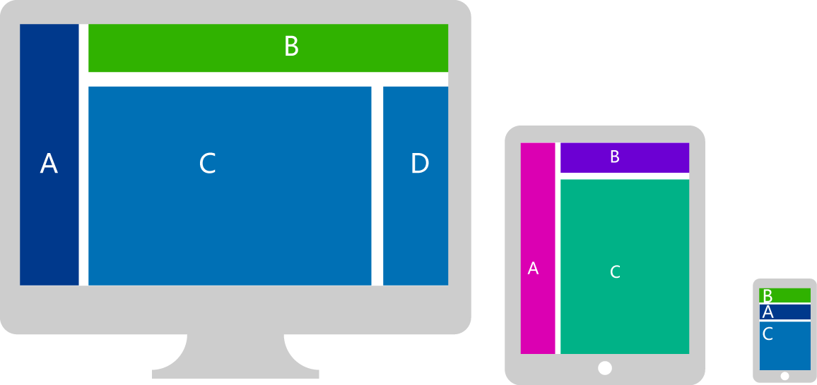
The concept of responsive web design is:
The design and development of the page should be responsive and adjusted according to user behavior and device environment (system platform, screen size, screen orientation, etc.). The specific practical methods consist of multiple aspects, including elastic grids and layouts, images, and the use of CSS media queries. Whether users are using laptops or iPads, our pages should be able to automatically switch resolution, image size, and related script functions to adapt to different devices; In other words, the page should have the ability to automatically respond to the user's device environment. Responsive web design is the ability of a website to be compatible with multiple terminals - rather than creating a specific version for each terminal. In this way, we don't have to do specialized version design and development for the constantly arriving new devices.
If you find it troublesome to create separate PC sites, mobile sites, iPad sites, etc. and want to build multiple sites at once, then choose responsive website design. If you have any needs, please feel free to contact: 13814894600!
Customer Profile: Jiangsu Tianrui Instrument Co., Ltd. is a high-tech enterprise with independent intellectual property rights, with a registered capital of 230.88 million yuan. It has two wholly-owned subsidiaries, Beijing Bangxin Weiye Technology Development Co., Ltd. and Shenzhen Tianrui Instrument Co., Ltd. Headquartered by the beautiful Yangcheng Lake in Kunshan City, Jiangsu Province. The company specializes in the research, development, production, and sales of analytical testing instruments and software for spectroscopy, chromatography, mass spectrometry, and other related fields. The company has been awarded honorary titles such as "National Torch Plan Key High tech Enterprise", "Jiangsu Province High tech Enterprise", "Jiangsu Province Software Enterprise", "Jiangsu Province Science and Technology Innovation Demonstration Enterprise", "Jiangsu Province Planning and Layout Key Software Enterprise", "Jiangsu Province Spectral Analysis Instrument Engineering Technology Research Center", etc. The product has internationally leading technological level, and the X-ray fluorescence spectrometer series products have been recognized as "National Key New Products" and "Jiangsu Province High tech Products". The product range is complete, providing professional solutions for environmental protection and safety, industrial testing and analysis, and other fields.
Responsive websites are deeply loved by customers. Below, Bomin editor will summarize them for everyoneSuzhou website constructionThe meaning of responsiveness:
The concept of responsive web design is:
The design and development of the page should be responsive and adjusted according to user behavior and device environment (system platform, screen size, screen orientation, etc.). The specific practical methods consist of multiple aspects, including elastic grids and layouts, images, and the use of CSS media queries. Whether users are using laptops or iPads, our pages should be able to automatically switch resolution, image size, and related script functions to adapt to different devices; In other words, the page should have the ability to automatically respond to the user's device environment. Responsive web design is the ability of a website to be compatible with multiple terminals - rather than creating a specific version for each terminal. In this way, we don't have to do specialized version design and development for the constantly arriving new devices.
If you find it troublesome to create separate PC sites, mobile sites, iPad sites, etc. and want to build multiple sites at once, then choose responsive website design. If you have any needs, please feel free to contact: 13814894600!
Previous: None
Next article:Congratulations to Bomin for signing with Jiangsu Jingwei Hongbo Automotive Parts Co., Ltd